It has arrived! Or should I say, they have arrived. The UseMyStats dashboard just received a major upgrade. You are no longer limited to 9 graphs, which is nice, but the real kicker is that you can now add all sorts of graphs to the dashboard!
We of course have the venerable line graphs that we have always had. We didn’t mess with this puppy as it’s been very successful so far, but we’ve had requests and so we figured we ought to bring him some reinforcements.
 |
 |
So meet the new gang of graphs!
First off, we completely re-built the pie charts so they were more useful and better looking, because for all the talk about what matters being on the “inside”, let’s face it. Graphs want to be pretty on the outside too (you can pick the colors)!
 |
 |
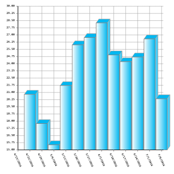
Then we signed up some bar graphs! Don’t leave home without them!! The play very nicely with the line graphs.
 |
 |
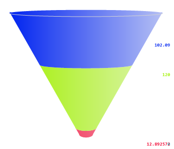
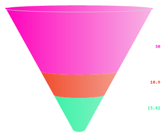
Not to be out done, some funnel charts volunteered to handle those situations where you want to see the flow of items from one to another. These aren’t just for sales people any more!
 |
 |
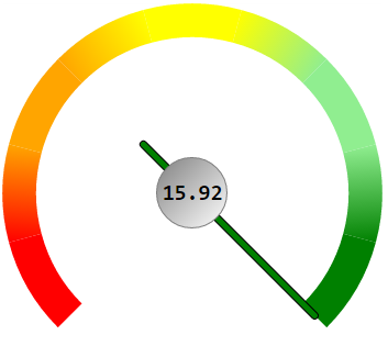
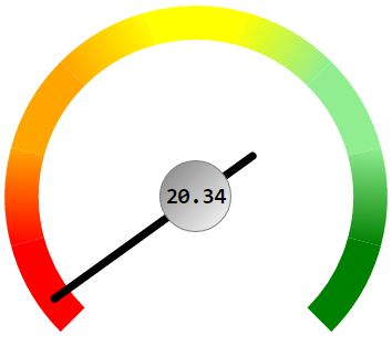
And because there are those times when you just want to make sure a stat stays within a certain range, we called up the long time friend of car dashboards everywhere, the Gas Gauge!
 |
 |
Now you can mix and match your dashboard however you want to be able to see exactly what you need to see at a glance. Then easily click on the title of the graph to pull up a larger version and manipulate things to get all the rest of the data you’ll need to really use your statistics to their fullest!